2D Spectral Pathtracing, Part 3: Importance Sampled Emission Spectra
One of the really cool things about spectral pathtracing is that you can simulate light sources in a much more rigorous way than simply representing them with an RGB tuple. That is not a lot of information, and it does not directly specify a spectral representation. There are some approximations which I think are going to be useful in particular for representing reflectivity and albedo, and I'm going to look into using that soon. This post mostly focuses on my first successful implementation of importance sampling, using the inverse cumulative distribution function which is derived from input sketched emission curves specifying a probability density function.
We see because we have photosensitive cells in our eyes. These cells are excited by photons, focused into an image by the lens at the front of your eye. For simplicity's sake, we usually reduce colors to a tristimulus representation like RGB to match the sensitivity of the different cells in the eye, and this is sufficient to handle the high, medium, and low ranges of the visible spectrum. This level of granularity is sufficient for almost all use cases, but in my prior work on this project, I've been exporing specifically the situations in which it is not. This includes dispersion, the ability to represent extremely saturated colors by mixing in XYZ space, and now the specific range of frequencies and relative amounts which are emitted by a given light source. This is a property of natural and artificial light sources, and gives them a lot of their individual subjective character.
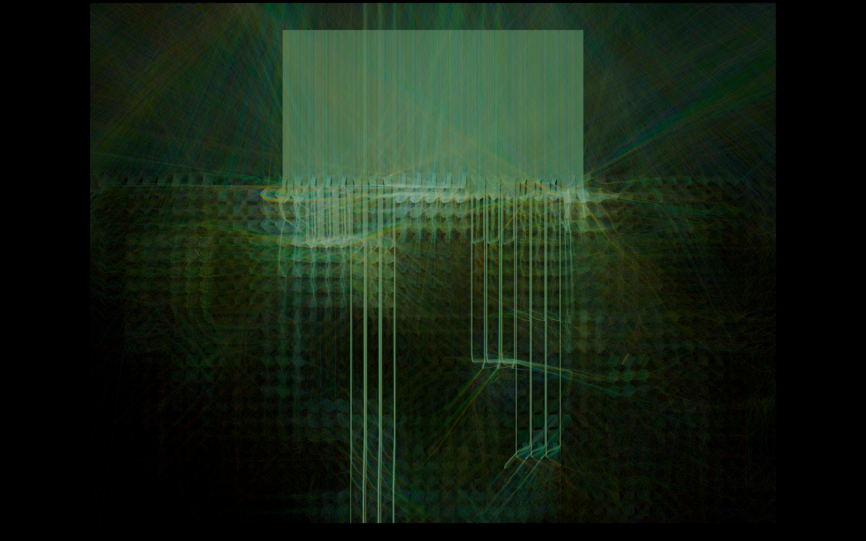
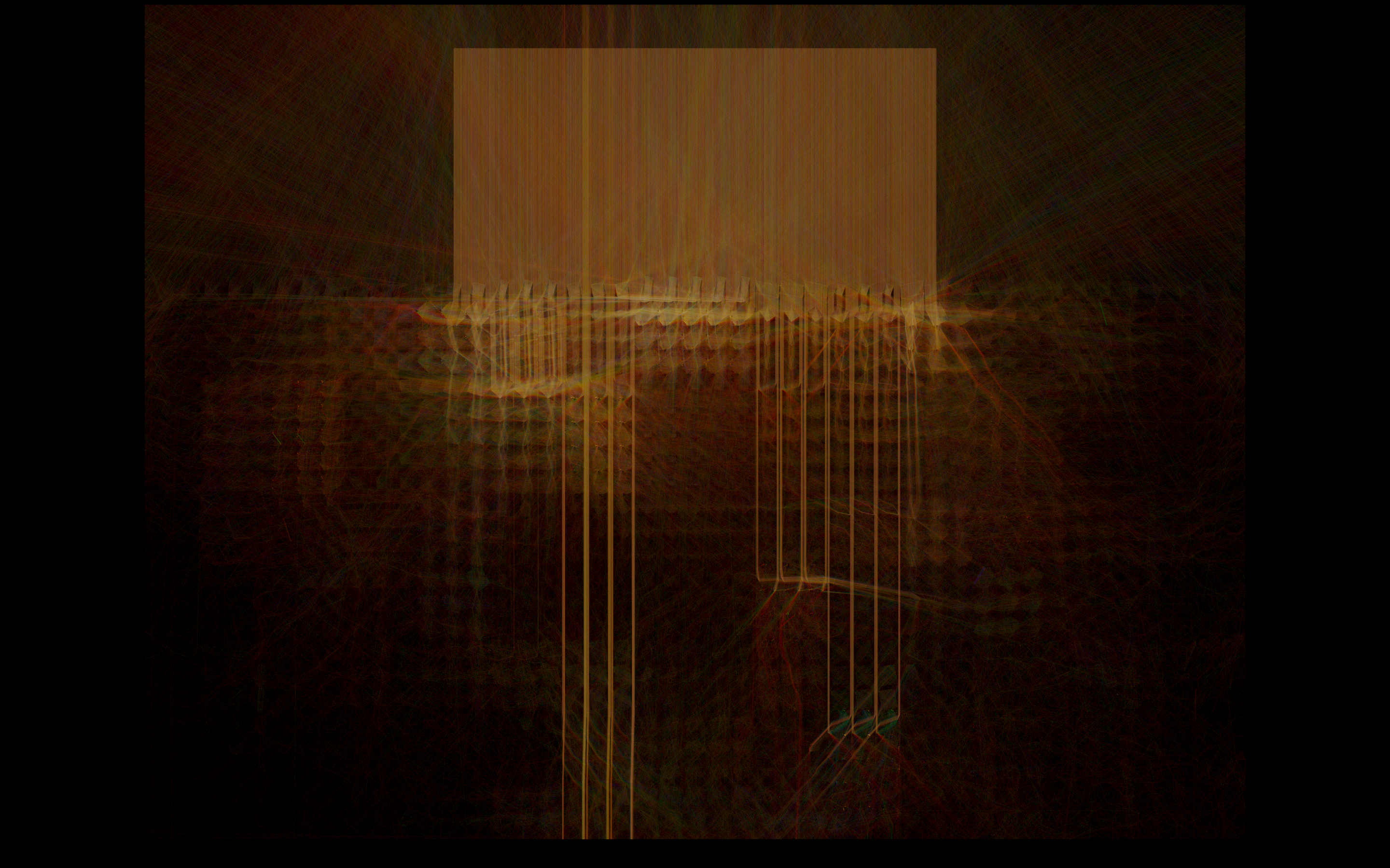
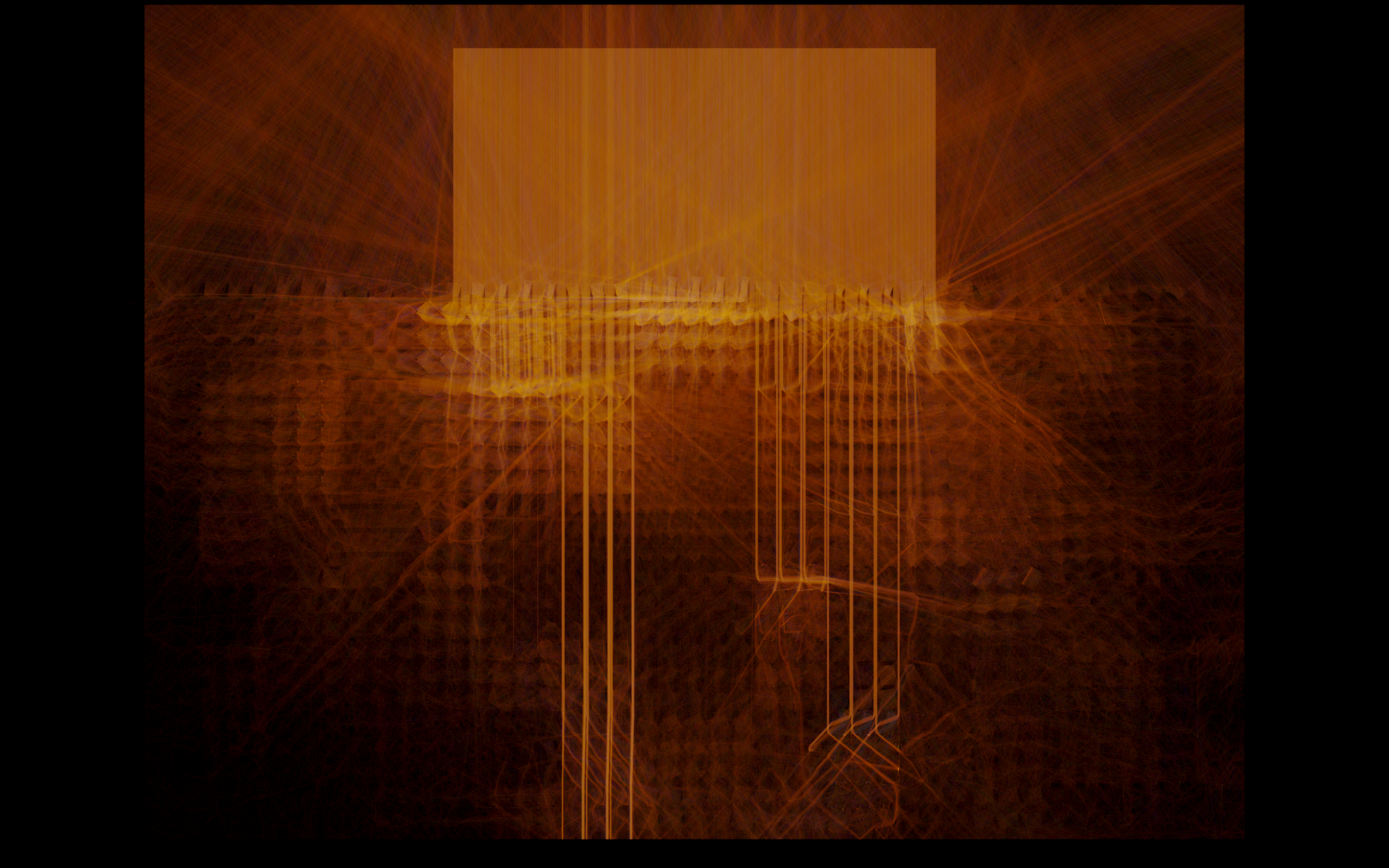
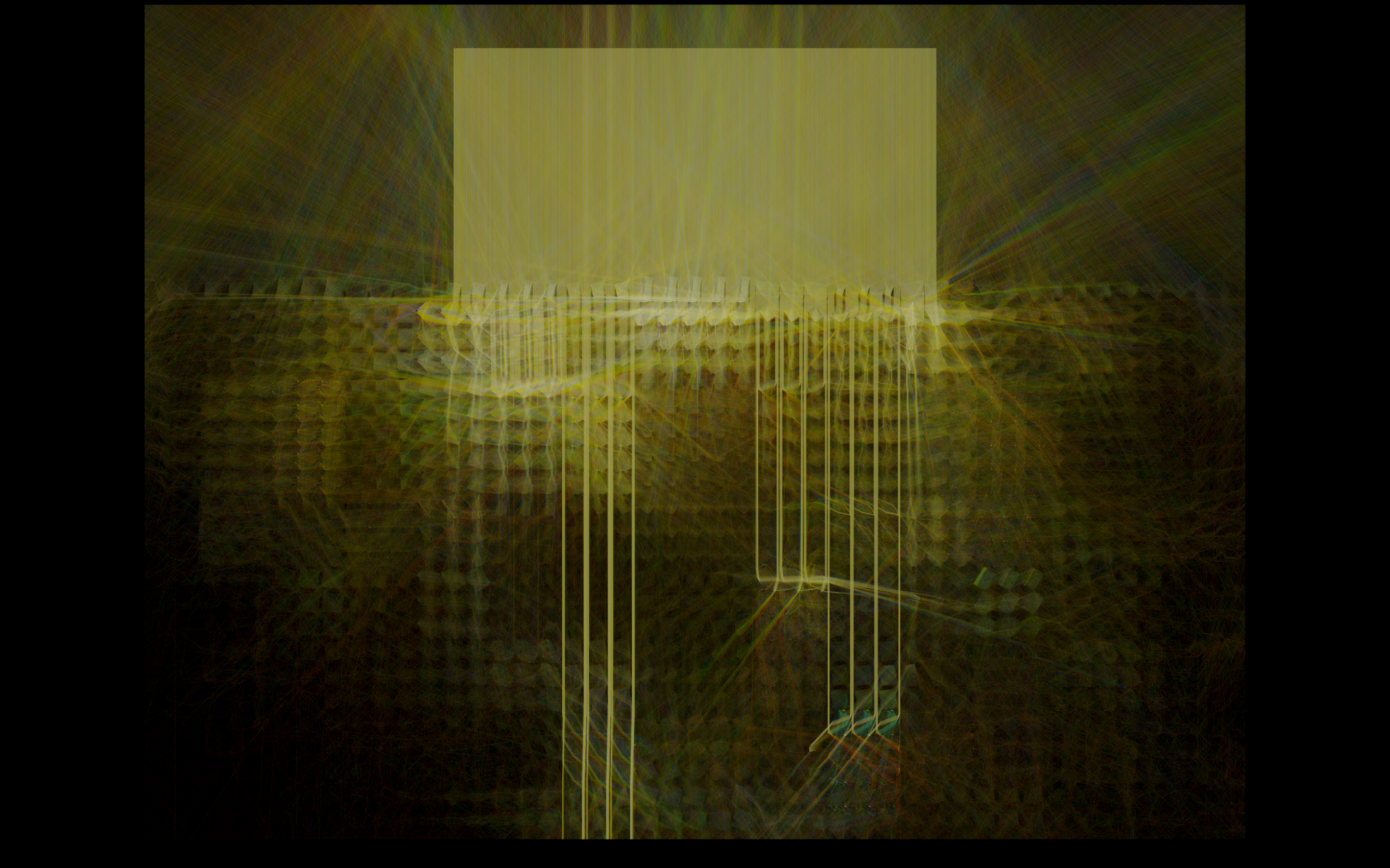
At the top of the page, you might recognize the fluorescent emission curve from old office lighting contrasted with a warm incandescent source. The fluorescent has the specific sickly green pallor that you can see in movies like The Matrix (1999)... this is not an approximation by postprocessing of the color values, but actually produced as a consequence of the distribution of choice of wavelength for the light rays that are injected into the scene.
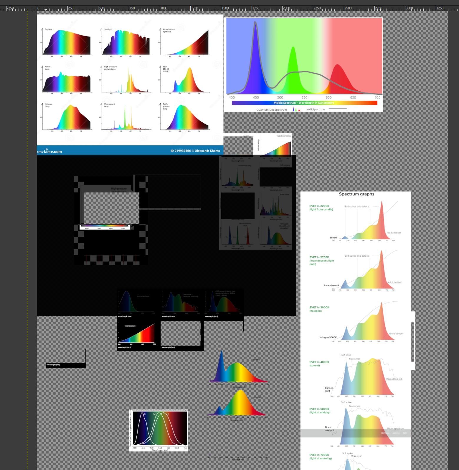
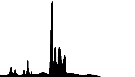
How do you represent this? It's quite a lot of information. I've taken kind of an interesting approach, building small human-readable/manipulatable LUTs like you can see on the left of each comparison images further down the page. I created them with scraps of data from an image search for 'emission spectra'. This is taken as input, interpreted as a probability density function. This gives us sufficient resolution to represent the relative amount of light emitted across the visual spectrum, from 380nm ultraviolet on the left to 830nm infrared on the far right. I included that extra range beyond the visual spectrum mostly because I can... I've been playing with full-spectrum photography the past few years, which uses optical filters in order to adjust the range of the visible (or outside of visible) spectrum you are capturing. The range of human vision is usually quoted as being from 380nm to 700nm, so we have quite a bit of data beyond what you can see with your eyes. Because I'm using the Sellmeier equations, everything should be able to faithfully represent the wavelength dependent refraction behavior well into this range of the spectrum, though a false-color setup of some kind would be required to visualize it.
Importance Sampling
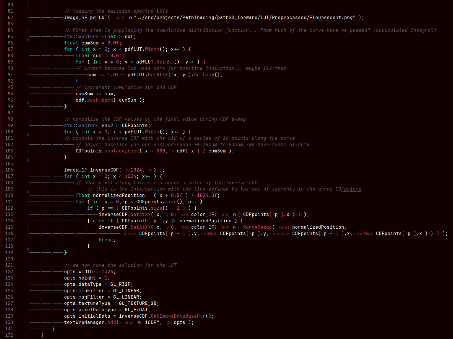
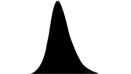
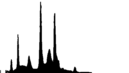
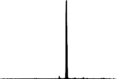
GPVM has been slowly going over the PBRT4 book the past year or so. One of the key fundamentals that it lays down in the intro chapters is the inversion method for generating random numbers of a desired distribution. This is a really key mathematical operation, because sometimes we only have a desired target PDF. The PDF is the probability distribution function and it expresses the relative likelyhood of results of a random number. Here, this role is played by some crude drawn emission spectra curves that I put together in GIMP (see image for stencil/crop process setup). These 450px wide images allow you to draw a black column of pixels for each integer wavelength between 380nm and 830nm, and provide a semi-human-readable input data format. These were all 256 pixels tall, but as you can see in the code that processes them, the pertinent quantity is the ratio of black pixels to white pixels.
Once you have your PDF LUT loaded from disk, you need to integrate to produce the CDF. This is the cumulative distribution function, and for a given position on the x-axis here, it defines "how much of the curve have we passed so far"... that is, the ratio of the integral that is to the left of the point on the axis to the total integral. This gives you a normalized result, which trends to 1.0 at x equal to infinity. A small but very key property of the PDF is that it must always have a positive result; this sounds unfounded until you realize that this enforces monotonicity in the graph of the CDF. That is, if we are integrating an always-positive function, we have an always-increasing CDF - there will be no x>x0 for which y=f(x) is less than y0=f(x0).
And that sounds like irrelevant minutae until the last step of the process... it's actually very pertinent and a key property. This is called the inversion method, because it inverts the CDF curve to create the inverse cumulative distribution function, the iCDF. You can do this with a change of variables, essentially this is mirroring the graph about y=x. Once you've done this, and because you have this monotonicity property, we come out with a result that is still a function with a single value for a given point in the input domain. That is, we now have a relation of 0 to 1 on the x axis, and something which will assist us in generating the desired distribution on the y axis.
I think it's useful for me to think about three main stages of the process: prepared PDF data, which has relative likelihood of a given value on the range, the cumulative distribution function, which is really only useful as an intermediary, and the inverse CDF. Because of the change of variables, we go from the CDF being a relation of our range of possible values to a value 0..1... to 0..1 now being the input range and the range of possible values being the output. And further, when you pass in a uniform random number, this output distribution also has the properties specified by the input PDF.
I've included a number of different emission spectra here, if you scroll down. I traced some random scraps of source data and used these prepared emission spectra PDFs during the picking of ray wavelength, so that it informs the prominence of the wavelengths across the range. Once we pick many samples like this using the inverse CDF, injecting rays representing that wavelength of light, we can accumulate an image that is characteristic of different light sources. I'm particularly drawn to the very nasty green color from the fluorescent LUT, it's really unpleasant in a very interesting way. All aspects of this approach are equally relevant to 3D and other spectral use cases.

And this is the code to load the spectra curve from the image on disk. Not a lot to it, but this was a valuable exercise for me to help understand this bit of math, to do the inversion method of importance sampling. I think I learn best with applied examples like this, it really helps me understand where and why a concept can be applied.